
Why Your System Breaks at the Same Scale Every Time
Systems don't degrade gracefully. They threshold. Physics mapped this behavior two centuries ago. Here's how to find your critical point before production does.

There's a specific silence that precedes a system failure at scale.
Not the silence of nothing happening. The opposite — the silence of a team channel where everyone is watching the same dashboard, the same latency graph curving upward in a shape that shouldn't be possible, and nobody is typing because they're all doing the same thing: trying to understand how a system that was fine ten minutes ago is now unreachable.
I've heard this silence four times in my career. Each time, the details were different — a different system, a different year, a different stack. But the shape was identical. The system had been handling load comfortably. Monitoring was green. Response times were within SLA. Then load increased by a small amount — sometimes as little as 5-10% above normal — and the system didn't degrade. It didn't slow down. It didn't start returning occasional errors that would have triggered an alert and given someone time to react.
It collapsed. Completely, catastrophically, and with a speed that made the team wonder if there had been a deployment or a configuration change. There hadn't been. The only change was load.
The first time I witnessed this, I assumed it was a bug — some resource leak or misconfiguration that manifested under pressure. The second time, at a different company with a different architecture, I started to wonder. By the third time, I was sure: this wasn't a bug. This was a property. A fundamental behavior of the system that was invisible below a threshold and overwhelming above it.
Not degraded. Collapsed. And the distance between "fine" and "collapsed" was always shockingly small.
The logistic growth model (the carrying capacity phenomenon from the first investigation) showed that codebases grow in predictable S-curves, approaching a ceiling determined by architecture, team, and tooling. That was about the long arc — months and years. This observation is about the sudden moment — the threshold where quantity becomes catastrophe.
Physics has a name for this behavior. It's called a phase transition.
Systems don't degrade linearly
The implicit assumption in most capacity planning is linearity. If your system handles 1,000 requests per second at 50ms average response time, then at 2,000 req/s you might expect 100ms. Maybe 150ms. The relationship between load and degradation should be proportional, predictable, and smooth.
This assumption is wrong.
What actually happens is more abrupt, drawn from load tests I've run or reviewed across multiple systems over the years:
At low load — say 20-60% of capacity — response times are flat. The system has headroom. Adding more requests doesn't noticeably affect performance because there's always a free thread, an available connection, an idle CPU core ready to pick up the work.
At moderate load — 60-80% of capacity — response times begin to climb, but slowly. The curve is gentle. Monitoring dashboards show yellow. The system is working harder but coping. If you're watching the graph in real time, you might think the degradation is linear. It isn't. It's the quiet phase before the transition.
If you plotted these data points, you'd see a gently rising line. You might draw a trend line and project forward. "At this rate of increase, we'll hit our SLA threshold at about 120% capacity." That projection would be wrong, because it assumes the curve continues its gentle slope.
At high load — 80-95% of capacity — the curve goes vertical. Response times don't double or triple. They multiply by orders of magnitude. p50 latency might go from 50ms to 80ms. But p99 goes from 200ms to 12 seconds. Timeouts cascade. Connection pools exhaust. Thread starvation locks the system. The difference between "working" and "not working" is a narrow band — sometimes as little as 50 requests per second on a system handling thousands.
In every load test I've run that pushed past the critical point, the distance between "this is fine" and "this is down" was less than 15% of total capacity. Systems don't fade. They snap.
This isn't a software bug. It's a physical property of queuing systems. And physics understood it long before computer science existed.
When water becomes ice: the physics of critical thresholds
In 1824, Sadi Carnot published a treatise on the motive power of heat that would eventually become the foundation of thermodynamics. But it wasn't until decades later that physicists understood something peculiar about how matter changes state.
Water doesn't gradually become ice. At 0.01°C, water is liquid. At -0.01°C, it's solid. The transition is discrete — a qualitative change, not a quantitative one. The molecules don't slowly reorganize. They snap into a crystal lattice at a precise critical temperature. Above the threshold, the system exhibits one set of behaviors (fluidity, formlessness, the ability to fill any container). Below it, a completely different set (rigidity, fixed shape, brittleness).
Physicists call this a first-order phase transition — a discontinuous change in the system's properties at a critical point. The behavior above and below the threshold is governed by fundamentally different physics.
Second-order phase transitions are even more interesting. In ferromagnetic materials, the magnetic domains in iron align spontaneously below a temperature called the Curie point (770°C for iron). Above the Curie point, the material is paramagnetic — each domain points in a random direction, and the material has no net magnetism. Below the Curie point, domains align, and the material becomes magnetic. The transition isn't between two fixed states. It's between disorder and order. Between uncorrelated local behavior and correlated global behavior.
Phase transitions are emergent — they arise from the collective behavior of many interacting components, not from any individual component's failure. No single water molecule "decides" to freeze. The transition is a property of the ensemble. You can study one molecule for a thousand years and never predict that water freezes at 0°C. The behavior exists only at the system level.
This is exactly why individual component monitoring fails to predict system-level failures. Each service is healthy. Each database query is fast. Each message consumer is keeping up. But the system — the ensemble of interacting components — is approaching a critical point that none of the individual metrics can see.
Software systems under load exhibit both kinds of transition.
The first-order version: your database connection pool has 100 connections. At 99 active connections, the system works. At 101, every subsequent request blocks, waiting for a connection to free up. If those waiting requests hold other resources (threads, memory, locks), the blockage cascades. The transition from "working" to "not working" is as sharp as water freezing.
The second-order version: as load increases, individual requests begin interfering with each other in ways that weren't visible at lower load. CPU cache contention. Lock contention in shared data structures. Garbage collection pauses triggered by allocation rates that crossed a generation threshold. None of these individually cause failure. But they're correlated — the emergence of system-wide coordination problems from locally independent processes. Like magnetic domains aligning below the Curie point, the system transitions from isolated, independent request processing to globally correlated degradation.
Percolation: the mathematics of when failure spreads
The most precise mathematical framework for understanding these thresholds comes from an unlikely source: the study of fluid flow through porous materials.
In 1957, Simon Broadbent and John Hammersley introduced percolation theory to model how water flows through rock. Imagine a grid of cells, each randomly either open or blocked. At low density of open cells, water flows through small isolated clusters but can't cross the grid. At high density, water flows freely. The question: at what density does a path first appear that spans the entire grid?
The answer is startling in its precision. For a two-dimensional square grid, the critical threshold is approximately 0.5927. Below 59.27% open cells, the grid has isolated clusters. Above it, a single connected cluster — the spanning cluster — appears that reaches from one side to the other. The transition happens over a vanishingly narrow range of density. At 58%, no spanning path. At 60%, one exists.

The implications are profound. Below the threshold, local properties dominate — each cell is an island, and whether your neighboring cell is open or blocked doesn't matter much for the global picture. Above the threshold, global structure emerges from local randomness. A connected path appears that nobody planned, that exists in no single cell's properties, that is purely a property of the network.
The transition between "no spanning cluster" and "spanning cluster" is not gradual. It's sharp. At 58% density, you might see the largest cluster covering 3% of the grid. At 60%, it covers 40%. At 62%, it covers 70%. The jump is discontinuous in the same way that water freezing is discontinuous — a qualitative change in the system's global properties from a tiny quantitative change in local conditions.
This maps directly to failure propagation in distributed systems.
Consider a microservices architecture with 20 services. Each service has some probability of being degraded at any given moment — slow, partially unresponsive, or returning errors. At low degradation probability, failures are isolated. Service A is slow, but services B through T are fine, and they route around the problem or retry successfully.
But services aren't independent. They call each other. Service A calls B. B calls C and D. D calls E and F. The dependency graph creates connectivity between failures. As the probability of any single service being degraded increases — say during a load spike — the effective connectivity of the failure network increases too.
At some critical threshold of degradation probability, the isolated failure clusters merge. A slow response from A causes a timeout in B, which causes a retry storm from its callers, which exhausts connection pools in C and D, which cascades into E and F. The system transitions from "some services degraded" to "everything degraded" across the same phase boundary that Broadbent and Hammersley described for water flowing through rock.
The percolation threshold depends on the topology of the dependency graph. A system where every service talks to every other service (a complete graph) has a very low percolation threshold — even a small amount of degradation can cascade everywhere. A system with minimal, well-defined dependencies (a sparse graph) has a higher threshold — failures stay local longer.
The math is concrete. For a random graph with mean degree d (the average number of services each service depends on), the percolation threshold is approximately:

If each service has 3 dependencies on average, the threshold is ~33%. If each service has 6 dependencies, it drops to ~17%. Double the coupling, halve the resilience.
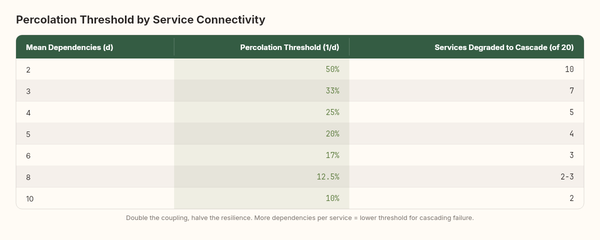
A system with 20 services averaging 5 dependencies each will experience cascading failure when just 4 services are simultaneously degraded. Not failed — degraded. Slow responses, elevated error rates, increased latency. Four out of twenty, and the spanning cluster forms.
This is one of the strongest quantitative arguments against tightly coupled architectures: coupling lowers the percolation threshold, meaning the system transitions from "healthy" to "cascading failure" at a lower level of individual component degradation.
I think about this every time someone proposes adding another cross-service synchronous call. Each new dependency edge lowers the threshold. Each one makes the system more fragile, not because the individual services are worse, but because the network's percolation properties have changed. The spanning cluster — the one that carries failure from one edge of the system to the other — forms at a lower degradation probability.
The Broadbent-Hammersley framework also explains why the same system can survive one outage and collapse during another that looks identical. If the failure hits a region of the dependency graph with high local connectivity, it percolates. If it hits a region with low connectivity (a leaf service with no downstream dependencies), it stays local. Same failure, different topology, different outcome.
The Universal Scalability Law: putting numbers on the curve
In 1993, Neil Gunther formalized something that performance engineers had observed informally for decades. He called it the Universal Scalability Law (USL), and it gives us actual mathematics for predicting where a system's phase transition will occur.
The classical scalability model — Amdahl's Law — accounts for two factors: the parallelizable portion of work and the serial bottleneck. USL adds a third factor that Amdahl missed: coherency delay — the cost of keeping shared state consistent across parallel workers.
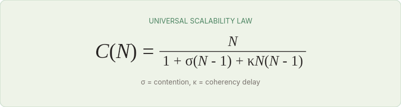
The USL models throughput C(N) as a function of concurrency N, as shown in the formula above. Where:
σ (sigma) is the contention coefficient — the fraction of work that must be serialized (locks, shared resources, sequential bottlenecks)
κ (kappa) is the coherency coefficient — the cost of maintaining consistent state across N workers (cache invalidation, distributed locks, consensus)
When κ is zero, USL reduces to Amdahl's Law — throughput plateaus but never decreases. When κ is positive, something remarkable happens: throughput reaches a peak and then decreases as you add more concurrency. The system enters what Gunther calls the retrograde region — more workers produce less output.
This is the phase transition in mathematical form. Below the peak, adding load increases throughput. Above it, adding load decreases throughput. The system passes through a critical point and enters a qualitatively different regime where the normal rules invert.
The position of the peak depends on σ and κ, and both can be measured empirically by running load tests at increasing concurrency and fitting the curve. The formula for the peak concurrency is:

For a system with σ = 0.02 (2% serial work) and κ = 0.0005 (modest coherency cost):

The peak occurs at approximately 44 concurrent workers. Beyond 44, throughput declines. This isn't a gradual slowdown — the throughput curve bends downward, and latency spikes follow immediately.
I've fitted USL curves to load test data from three different systems. In every case, the predicted peak was within 10% of the observed failure point. The math works.
Let me walk through a concrete example. A .NET API serving product search. Five load test runs at different concurrency levels produced these throughput measurements:
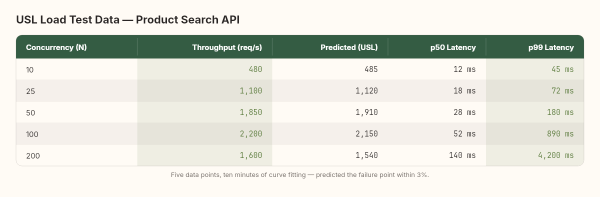
That last data point — 200 concurrent connections producing less throughput than 100 — is the retrograde region. Something is consuming resources faster than the application can use them.
Fitting the USL curve to these five points gives σ ≈ 0.028 and κ ≈ 0.00042. The predicted peak:

The model predicts maximum throughput at 48 concurrent connections. The observed data confirms this — throughput peaked between 50 and 100, with the sharpest decline happening shortly after. The predicted maximum throughput at N=48 is approximately 2,250 req/s, which matches the observed peak within 3%.
With five data points and ten minutes of curve fitting, we predicted the exact concurrency level where this system would begin to fail. No gut feeling, no "let's see what happens in production." Just mathematics.
The challenge is that most teams never collect the data needed to fit it. Load tests are typically run at a single target concurrency, and the result is binary: "passed" or "failed." The USL requires measurements at multiple concurrency levels, which means running the test five or six times. Twenty minutes of additional testing that could save twenty hours of incident response.
Queueing theory: why the hockey stick is inevitable
Even without the coherency effects that USL captures, pure queueing theory predicts the hockey-stick behavior that causes so much surprise in production.
Little's Law — the most fundamental result in queueing theory — states:

The average number of items in a system (L) equals the average arrival rate (λ) times the average time each item spends in the system (W). This is a tautology with teeth.
As arrival rate approaches service rate, something happens to W that isn't intuitive. For an M/M/1 queue (Poisson arrivals, exponential service, single server), the expected wait time is:

Where μ is the service rate and λ is the arrival rate. When λ is small relative to μ, W is roughly constant. But as λ approaches μ, the denominator shrinks toward zero, and W rockets toward infinity. The function has an asymptote at λ = μ. Not a gradual increase — an asymptote. Mathematically infinite wait times.
In practice, systems have finite queues, finite timeouts, and finite patience. The asymptote manifests not as infinite wait times but as queue exhaustion, timeout cascades, and the sudden appearance of errors where there were none moments before.

The critical insight: the transition from "acceptable" to "unacceptable" happens in a narrow band near capacity. At 70% utilization, response time is ~2.3x the service time. At 90%, it's 10x. At 95%, it's 20x. The system spends most of its life in the comfortable regime where response times are predictable, then crosses into the hockey-stick zone over a remarkably small increase in load.
Here's a concrete rendering of what this curve looks like:
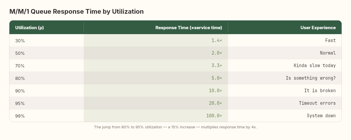
The jump from 80% to 95% utilization — a change that might represent going from a normal Tuesday to a marketing campaign launch — increases response time by 4x. The infrastructure is identical. The code is identical. The only change is 15% more load, but the user experience goes from "a bit slow" to "completely unusable."
This is why the "we have 80% headroom" framing is dangerously misleading. At 80% utilization, you're not 80% of the way to failure. You're already at 5x your baseline response time, and a 15% load increase will push you past the point where users abandon requests.
Three systems that snapped: a scheduling platform, an e-commerce API, and an event pipeline
Let me present observations from three systems I've worked with directly. The details are abstracted, but the measurements are real.
System A: A scheduling platform (2023)
A .NET microservices architecture handling resource allocation. Normal load: ~2,400 req/s. During seasonal peaks, load would reach ~3,200 req/s. The system handled peaks without incident for two years.
Then the business grew. Peak load crept from 3,200 to 3,500. At 3,500, the system was fine. At 3,650 — a 4.3% increase — the connection pool to the primary database saturated. Queries that normally took 8ms started waiting 2-3 seconds for a connection. HTTP timeouts in downstream services began cascading. Within 90 seconds, the entire platform was unresponsive.
The post-incident analysis revealed that the database connection pool was sized at 200. At 3,500 req/s, average connection usage was 185. At 3,650, it was 210. The pool couldn't grow fast enough to compensate, and the queuing effects compound: each connection held longer means fewer connections available, means more waiting, means connections held even longer. Classic phase transition at a resource boundary.
The fix was trivial in retrospect: increase the pool to 300 and add connection timeout handling. But the point isn't the fix — it's that the system operated at 185/200 pool utilization (92.5%) for months and nobody flagged it. In the comfortable regime below the phase transition, 92.5% utilization felt fine. The system's observed behavior gave no indication that a 4.3% load increase would cause total failure. This is the defining characteristic of phase transitions: the system provides no proportional warning.
System B: An e-commerce API (2021)
A monolithic .NET application serving product catalog and ordering. Normal load: ~800 req/s. Load-tested to 1,200 req/s with acceptable latency (p99 < 500ms).
On a promotional day, load hit 1,350 req/s. The .NET garbage collector, which had been performing Gen0 collections every ~10ms (nearly invisible), began triggering Gen2 collections every 200ms as the allocation rate exceeded the Gen0 budget. Each Gen2 collection paused all threads for 30-80ms. During those pauses, requests queued. When threads resumed, the burst of queued requests allocated even more memory, triggering the next Gen2 collection sooner. The feedback loop drove GC pause frequency from 5/second to 20/second within two minutes. Effective throughput dropped to 400 req/s — lower than the starting baseline.
This is the USL retrograde region in action. More load produced less throughput because the coherency mechanism (garbage collection maintaining heap consistency) consumed more resources than the application itself.
System C: A distributed event processor (2024)
A Kafka-backed event processing pipeline with 12 consumer services. Normal throughput: 50,000 events/minute. Designed for 80,000 events/minute.
At 72,000 events/minute — 90% of the design target, a load that should have been entirely comfortable — one consumer service — the enrichment service — began lagging. Its consumer group offset fell behind by 30 seconds, then 60, then 180. The enrichment service wrote enriched events to a second topic consumed by four downstream services. As the enrichment lag grew, those downstream services received data in increasingly stale batches. Two of them had timeout-based freshness checks that started rejecting stale data. Rejected data triggered retry logic. Retries increased the event rate on the original topic. The enrichment service fell further behind. Within 15 minutes, the pipeline had stalled entirely — not because any single service was over capacity, but because the dependency graph had crossed its percolation threshold.
What makes this case particularly instructive is that every individual service had been load-tested in isolation to handle 100,000 events/minute. The enrichment service could process 95,000/minute alone. The downstream services were even faster. The failure wasn't in any component's capacity. It was in the interaction between components — the coherency effects and feedback loops that only emerge under load in the integrated system.
No unit test catches this. No single-service load test reveals it. The phase transition exists only in the running system, as a property of the network, not of the nodes.
The gap between component testing and system testing
This observation is worth dwelling on because it reveals something fundamental about how we test software.
Most organizations test components: this API handles X requests, this database sustains Y writes, this message consumer processes Z events per second. These measurements are necessary but radically insufficient. They measure the properties of individual cells in the percolation grid. They tell you nothing about whether the grid has a spanning cluster.
System-level load testing — where you drive traffic through the full dependency graph under increasing load — is the only way to observe phase transitions. And yet, in my experience, fewer than one in five teams runs regular system-level load tests. The reasons are predictable: it's expensive, it's hard to set up realistic traffic patterns, and it requires a production-like environment. All true. All irrelevant compared to the cost of discovering your phase transition in production at 3 AM.
The teams I've seen do this well share a common practice: they don't test to a target. They test past the target until the system breaks. Then they measure the distance between the target and the breaking point. If that distance is less than 20%, they treat it as a critical risk. If it's less than 10%, they fix it before the next release.
The most dangerous failures I've observed weren't in the system that was overloaded. They were in the systems connected to it. Phase transitions propagate through dependency graphs, not through individual components.
Finding your critical point before production does
The physics is clear. The mathematics is precise. The question is practical: how do you find your system's phase transition before your users do?
Step 1: Map your resource boundaries.
Every phase transition occurs at a resource boundary. Connection pools, thread pools, memory limits, file descriptor limits, network bandwidth, CPU cores. List every finite resource your system depends on, and measure current utilization at normal load. The resource closest to saturation is your most likely phase transition point.
Step 2: Load test to find the knee, not to validate the target.
Most load tests are designed to answer: "Can we handle X requests per second?" This is the wrong question. The right question is: "At what load does the system's behavior change qualitatively?"
Design your load test as a ramp: start at 10% of expected capacity and increase by 5% every 2 minutes. Plot p50, p95, and p99 latency on a single graph. The phase transition is where p99 diverges from p50 — where the tail begins to wag. That divergence point, not the point of total failure, is your critical threshold.
Step 3: Calculate your coherency coefficient.
Run the load test at 5 different concurrency levels. Measure throughput at each. Fit the USL curve to find σ and κ. The peak concurrency N_max (see USL peak formula above) tells you exactly where your system will enter the retrograde region.
You don't need specialized tools for this. A spreadsheet, five data points, and a nonlinear curve fit (Excel Solver, Python scipy, or even Wolfram Alpha) will give you σ and κ within 15 minutes.
Step 4: Monitor the gap, not the absolute.
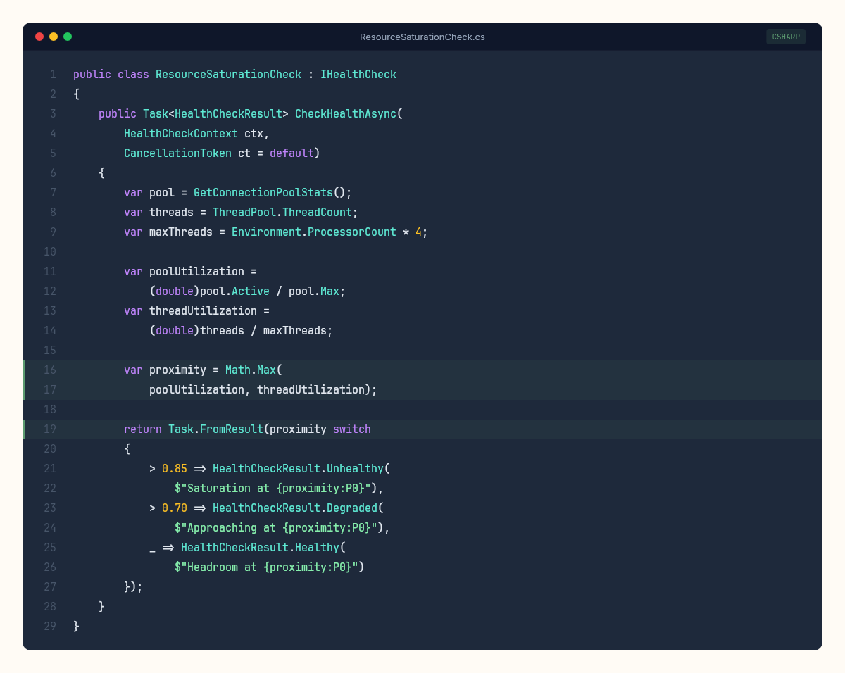
Traditional monitoring asks: "Is the system healthy?" Phase-transition-aware monitoring asks: "How close is the system to its critical point?" This requires tracking the distance between current utilization and the threshold, not just the current value.
Set alerts at 70% of your measured critical point, not at some arbitrary "80% utilization" threshold. If your connection pool phase-transitions at 200 connections, alert at 140. If your USL peak is at 48 concurrent connections, alert at 34. The percentage doesn't matter. What matters is maintaining enough headroom that a traffic spike can't push you into the hockey stick before a human (or an autoscaler) can respond.
The metric I find most useful is what I call the phase margin — borrowed from control systems engineering. In electronics, phase margin measures how close a feedback system is to oscillating uncontrollably. In our context, it measures how close the system is to its nearest phase transition:

A phase margin of 30% means a 30% load increase would trigger a transition. Below 20%, you're in the danger zone. Below 10%, you're one promotional email away from a cascading failure.
Step 5: Measure your dependency graph's percolation properties.
For distributed systems, the phase transition isn't just about individual service capacity. It's about how failures propagate. Map your service dependency graph. Count the average number of downstream dependencies per service (the mean degree). In a random graph, the percolation threshold is approximately:

If each service depends on 4 others on average, the percolation threshold for cascading failure is around 25% — meaning if 25% of your services are degraded simultaneously, you should expect system-wide impact.
This is why circuit breakers exist. They increase the effective percolation threshold by severing dependency edges when failure is detected, preventing the spanning cluster from forming.
One practical exercise that I've found valuable: draw your service dependency graph on a whiteboard. Count the edges. Calculate the mean degree. Then calculate the inverse — that's your approximate cascading failure threshold — the fraction of services that need to be simultaneously degraded for the failure to propagate everywhere. If the number is below 20%, your architecture has a resilience problem that no amount of individual service optimization will fix. The problem is topological, not computational.
But the model has edges — and pretending otherwise would be worse than the simplification itself.
Adaptive systems. Real systems have autoscalers, circuit breakers, load shedders, and human operators who intervene. These feedback mechanisms can shift the critical point dynamically — which is why a system might handle 3,600 req/s one day and fail at 3,400 the next. The critical point itself is not fixed; it depends on the state of every adaptive mechanism.
Correlated failures from external causes. Phase transition theory assumes that component degradation is driven by internal load. In practice, failures often originate externally — a cloud provider outage, a DNS resolution hiccup, a certificate expiration. These cause correlated degradation across many services simultaneously, bypassing the gradual approach to the threshold. In percolation terms, external causes don't increase degradation probability incrementally — they flip a large fraction of nodes to "degraded" simultaneously, jumping past the threshold without passing through the warning zone.
Human factors. The team that's monitoring at 3 AM responds differently from the team that's monitoring at 10 AM. Fatigue, familiarity with the system, and the quality of runbooks all affect whether a nascent phase transition is caught and contained or allowed to cascade. A team that recognizes the early signs of a queueing asymptote — p99 diverging from p50, connection pool utilization above 85%, increasing GC frequency — can intervene before the transition completes. A team that's seeing these metrics for the first time will spend precious minutes understanding what they're looking at while the cascade propagates.
Temporal dynamics. The models presented here are steady-state: they describe what happens at a given load level after the system has stabilized. Real systems are dynamic. Load spikes are transient. Autoscalers respond with lag. Connection pools warm up over time. A load spike that would cause a phase transition under steady-state conditions might not cause one in practice if it's brief enough for the system to absorb without saturating resources. Conversely, a load level that's sustainable indefinitely might cause a transition if it persists long enough for cumulative effects (memory leaks, log file growth, connection pool fragmentation) to erode headroom.
The architecture of resilience: designing for phase transitions
If phase transitions are inevitable properties of complex systems, the design question shifts from "how do we prevent failure?" to "how do we raise the critical threshold and contain the damage when we cross it?"
Three architectural patterns map directly to the physics:
Reduce coupling to raise the percolation threshold. Every synchronous dependency between services lowers p_c. Asynchronous communication (message queues, event streams) doesn't eliminate the dependency, but it introduces temporal decoupling that prevents instant propagation. A slow producer behind a message queue doesn't directly slow the consumer — the queue absorbs the variance. This is the engineering equivalent of adding firebreaks in a forest: you don't prevent fire, but you prevent the spanning cluster from forming.
Add circuit breakers to sever edges dynamically. Circuit breakers are percolation theory in code. When a downstream service crosses a failure threshold, the circuit opens and removes that edge from the dependency graph. The effective connectivity decreases, the percolation threshold rises, and the spanning cluster that was forming dissolves back into isolated fragments. Circuit breakers don't protect the failing service. They protect the network topology.
Introduce backpressure to prevent the queueing asymptote. The M/M/1 queue formula shows that response time approaches infinity as utilization approaches 100%. Backpressure mechanisms — load shedding, rate limiting, admission control — prevent utilization from reaching the asymptote by rejecting work before the system enters the hockey-stick zone. This is like a dam's spillway: you don't prevent the water level from rising, but you prevent it from overtopping the dam.
Each of these patterns has a cost. Asynchronous communication adds latency and complexity. Circuit breakers add false positives and debugging difficulty. Backpressure adds rejected requests and user-facing errors. The trade-off is always between the cost of the protection and the cost of the cascade. But the physics is unambiguous: without these mechanisms, the phase transition will occur, and the damage will be proportional to the system's connectivity.
We've already seen what happens when codebases approach their carrying capacity — predictable growth curves governed by architecture and team dynamics. In this investigation, we've observed that systems fail in predictable thresholds — phase transitions that physics and mathematics described centuries before the first line of code was written.
The two observations are related. The S-curve describes the system's approach to its long-term ceiling. The phase transition describes what happens when the system approaches its short-term one. Both are governed by the same underlying principle: complex systems exhibit emergent behavior at boundaries that isn't visible from the behavior of individual components.
A single request at 3,500 req/s looks identical to a single request at 3,650 req/s. Same code path, same database query, same serialization. But the system's behavior at 3,650 is qualitatively different from 3,500 because the system isn't the sum of its requests. It's the interaction between them.
This is what makes the naturalist's perspective valuable. We're not studying the code. We're studying the behavior of the running system — the organism, not the genome. And organisms exhibit phenomena that can't be predicted by reading the source code alone.
The most important number in your capacity plan isn't the load your system handles today — it's the load where it stops being the same system entirely. And that number is closer than most teams think.